THE VISION
Rooted in our belief in the transformative power of independent artists, culturally, socially and politically when their work meets audiences, this year’s Festival represents a new convergence that will bring together the power of the in-person experience with the access and innovation of our digital experience that debuted in 2021. This isn’t two festivals — it’s one multidimensional Festival where filmmakers and film lovers from around the world will come together to celebrate independent voices and visions.

THE COLLABORATION
This identity is the outcome of a close collaboration between the Sundance Institute, DeeDee Gordon of The Gordon Co., and The School of Visual Arts Masters in Branding Program, where the program class and six program alumni worked together under the guidance of their professors Mark Kingsley and Dr. Tom Guarriello, alongside Gordon and our former creative director, Luis F. Farfán. This collaboration shows the nonprofit Institute’s commitment to supporting artists in all disciplines, and is a joint partnership between two institutions dedicated to fostering and promoting forward-thinking ideas in the visual arts.
THE COLOR THEORY
The color theory for the 2022 Festival is inspired by our Park City home — a vibrant landscape that shapes the in-person (aka on-the-mountain) experience, and whose colors will inspire vibrant online connections.

THE WORDMARK
The new Festival logo takes inspiration from the sun as a point of convergence. Its light is a beacon. Our Festival is an invitation for all to join us.

THE ICONS
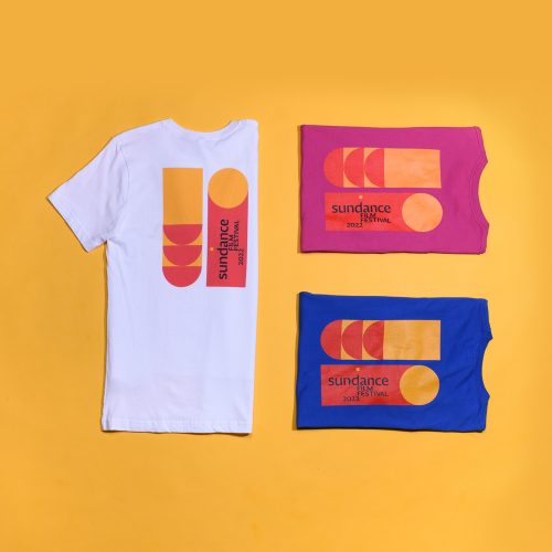
Our icons are timeless hieroglyphical compositions that represent the sun, its movements, and its radiance. The relationships between the forms reflect a sense of our star’s relationship to, and convergence with, other celestial objects and phenomena. The graphics are a nod to the earliest forms of storytelling and communication, and a complement to the calligraphic typeface that anchors our wordmark.

THE APPLICATIONS
Our icons, colors, and typography combine to create a range of applications, products, and experiences that feel vibrant and diverse, while maintaining an overall visual consistency and impact.
THE MERCH


