ATBS Frames, Pt. 1
David Lowery, director, Ain’t Them Bodies Saints
David Lowery attended the 2012 Sundance Institute January Screenwriters Lab with his screenplay for Ain’t Them Bodies Saints, an Official Selection of the 2013 Sundance Film Festival. Below is the first part in a series of blog posts examining a single frame from the film. Ain’t Them Bodies Saints opens in theatres August 16 and On Demand August 23.
Working on a film, there always comes a point where you get tired of the scenes, the dialogue, the entire story. You can’t see it as a whole, and when you can that whole sometimes feels terrible. But there are always little things that allow you to refocus, and in the case of this movie, I would often seize upon frames that reminded me that we’d been after something strong with the movie, that we had intention and point of view. These shots would tip my favor back towards the movie and get everything ship-shape again. And they still do. I want to spend this week talking about some of them – a commentary track in text, one image at a time.
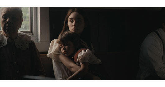
This first one is from early in the film. It’s part of a montage, but hopefully it carries its own weight all the same. It is evidence of one of the primary visual motifs of the film, which is that the framing is almost entirely centrist, with the subject usually occupying more or less the middle of the image. Usually a bit canted, almost dead-on. I wanted everyone to be framed like icons. In fact, looking at it now, this shot feels lifted right out of Marian Iconography. There’s that Roman Catholic upbringing rearing its head.
I love that elderly woman’s face.
Finding a church that looked like this was difficult. I wanted something classic, monochrome, with wooden pews. Preferably with clapboard walls. Everything we found was either very modern or very tacky, with a preponderance of purple carpeting; simplicity and austerity was hard to come by. It was well into our shoot before we discovered this one, out in a suburb in the middle of nowhere. The inside was perfect, very dark in spite of an abundance of windows. I recall the day we found it, people were riding down the street on horseback.
I remember telling Bradford that I wanted it to look like it was entirely lit from outside. This was one of very few locations where we actually wanted the natural light look. Which doesn’t mean that it didn’t take a while to light. I think we wound up with big lights with CTB on them, punching in through the windows from outside.
I went back and forth on whether or not I wanted Ruth to look directly into the lens for this shot. I was thinking of Two Lovers, that astounding moment where Vinessa Shaw nails the lens. We tried it, but it wasn’t really necessary. That Ruth was making eye contact with someone at all was enough. Later in the shoot, we did let her look into the lens for a different scene, which was ultimately cut out. The fourth wall remains largely intact in this movie.
I think Sylvie was really asleep in this shot, or close to it at least. Filmmaking in a church – boredom upon boredom.
Early in the edit, this shot fell into place as part of a montage, one cut it to music and almost entirely free of production audio. If we’d left it in, you’d have heard Dutch, our 1st AD, reading Psalms from up on the pulpit. That would have been his second vocal cameo; his voice is also the one in prison which delivers to Bob Muldoon the news that he has a baby girl. Recorded on set to give Casey something to react to, and never bested.


