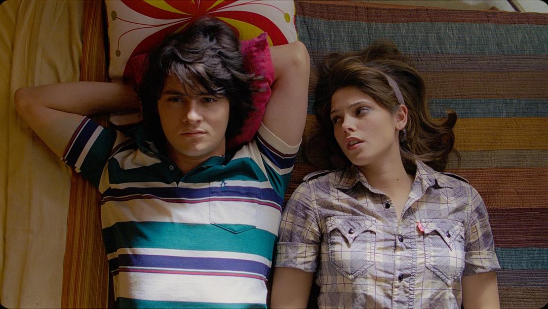
A still from Anthony Burns’s Sundance film ‘Skateland.’
Sundance Institute
Bad news. A film set in the 1980s is a now considered a period film. Director Anthony Burns and writer Brandon Freeman came to that conclusion fairly easily when setting Skateland in early ’80s East Texas.
“Music, politics, cable television pouring into living rooms (specifically MTV), the resurgence of conservatism, and the women’s rights movement both at home and the workplace played a crucial role in deciding to make the film a period piece,” says Burns.
To cultivate the film’s ’80s feel, Burns turned to DP Peter Simonite, whose attention to detail eventually earned him the nickname “The Mad Scientist.”
“A friend of mine introduced me to Peter in my kitchen,” he said. “Peter had been the cinematographer on a few award-winning music videos and came highly recommended. However, this was my first feature and would be his first feature as DP. Initially it was a major concern, but after long conversations discussing our taste, and his enthusiasm for the script, it became an easy choice.”
While the pic was his first, Simonite was far from a first-timer. The Austinite brought 12 years of time as an assistant cameraman and was eager to spend his banked experiences having worked with some of the top cinematographers in the industry.
One thing Simonite has learned is that the director must bring a visual aesthetic to work from: “If the director is not visual it’s harder. Sometimes they just want the basic building blocks for the story. The trouble is you can’t visually exceed what the director wants.”
Yet Burns and Simonite found common, and fertile, ground in the film’s look. Taking iconic photographs from Stephen Shore, William Eggleston, and Wim Wenders, they used the eye dropper tool in Photoshop to pull out colors, creating a palette they later gave to the production and costume designers.
“I had just finished working on Terrence Malick‘s Tree of Life (shot by Emmanuel Lubezki),” says Simonite, “So I just carried over the lens and lighting package list.” Simonite also brought over Life’s gaffer (Mark Manthey) and the film’s “dogma”—a systematic approach to each shot that Malick and Lubezki used to create a very clean and natural look. “Emmanuel’s philosophy is to light spaces, not faces. And that’s something we wanted.”


